for the first time in malaysian movie history, we're gonna have a human backside on the poster, not to mention, a movie that shows lots of flesh -- literally a "wayang kulit"! i hope you do the authorities' heads in! muahahahaa!
Af, I like the posters cos its different than your other movies.I think u got to be the leading Malaysian Male to promote Malaysian movies that is not mainstream but has issues to be discussed.Good on ya.... www.ibanguy.blogspot.com
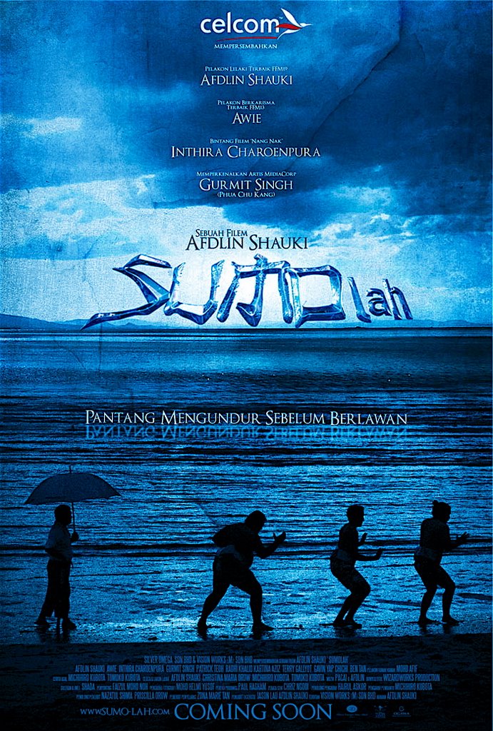
The blue one is beautiful, very professional, but kind of runs a different commentary in your head of what the movie is about. Maybe a combination of the blue one and the Malaysian edition? The one underneath is better, if only it were REAL interpretation of a sumo wrestler, i.e. one that doesn't wear pants underneath his costume. Be daring, bro! Just do it!
aloo blubber.. hmm... the blue one looks good i thought.but mebbe the title should be made a bit more gempak? bigger fatter font mebbe?
the 2nd one ok gak actually except for the tights la, lebih "kena" with sumolah.if lu tanak bukak aurat tunjuk ur bum (cellulite can be airbrushed one dont worry...), then guna la stand-in with healthier buns. jangan marah ha..
Not to say i hated the Local Poster, but i prefer the international poster better then the local one. Both international poster are awesome. Why not just throw away the local one and just out these two locally...
Brudder, here's my 5 sen la. None of the posters really tell viewers what to expect of the film but the one with the beach scene is the most engaging. Visually. And yes the "Malaysian" poster does look...too Malaysian.
1st: 1)cantik 2) laut and org tgh practice : mcm ada menceritakan sthg... 3)air laut- represent unsur2 soft 4) tingat cite karate kid bila tgk poster ni
2nd: 1)like it 2) nampak gempak - powerful 3)tapi knape body dia nampak ramping? - sumo bukan x berapa ramping sgt ker?
I agree with Patrick Teoh. The posters tell too little of the movie. They are nice pics... but they show none of the movie's comedic value or entice the audience.
It's too vague... Imagine Jack Black's Shallow Hal poster (it gets the message across with one poster). Ok, in order to get my point across, I'll use a more recent example, the "John Tucker Must Die" poster. Nice but I don't get the gist of the movie from it. I shouldn't have to read a synopsis... or watch the trailer to want to watch the movie.
For an international movie... I think "The Host" (korean) does it very well. The little girl with a helpless expression and the legs of a creature blurring out of focus behind. The poster should tell a story (especially when the audience doesn't know who is Afdlin, Patrick or Gurmit), it shouldn't just focus on a scene.
It should captivate those foreigner's imagination with a story... not a scenery. That's all I am saying. As for the local poster, hey if it works here. I think it looks great.
my suggestion: face of an intimidating angst sumo wrestler (it's you in this case), in the middle, medium close-up profile, wiping blood or sweats, backed with other casts watching, in the middle of the sumo fighting rink. the message will cross like this: here's a sumo wrestler with full determination to strive for his goal - PANTANG MENGUNDUR SEBELUM BERLAWAN.
en afdlin!!! I like the blue poster!! any chance of screening it in Oz? I just got here, study, will be missing many fantastic malaysian movies ('cinta', yours, yasmin ahmad's) yeah, will surely help promote it if it gets screened here! =)
en afdlin, byk sgt tgk teaser posters nih, dah tak tertease nih. Knp x tayangkan sooner. Coz' by 2007, I'll be in Temerloh. Temerloh takder cineplex or cinema. uwaaa anyway, my way or the hiway, ;) the blue one tu, a bit the mysterious. x dpt impact terus ke hati. ala2 kena cucuk ngan duri ikan pari baru best. the 2nd better. dia ada link ngan title. klu bley nmpk real butt. hehhe
hmmm, it doesnt matter which poster ur gonna use. the malaysian version is okay. so are the so-called international ones. either way, people will still flock to your movie regardless of which poster you put up hahaha.
the blue one doesnt look like a comedy..the second one, action oriented? the malaysian one looks distinctive malaysiana (putting the whole actors into one poster) and u know its a comedy (the way the actors are potrayed)..is this a comedy or an action pack saga mix drama 'against all odds' like Karate Kid?
im a bit kura2x when come to following your project..anyway...bulik balik baru jek tgk..klakar...its like a compilation of stories from you n friends...macam real life events...
Anyway...about the 2 posters..i think...:
no 1) The blue is really nice....tapi bila tgk sumo jln kan macam iklan yg apes jalan ...yg macam kat dlm mag National geograpic tu...macam the first human on earth tu...i dont think u understand what im trying to say but macam tu la..
Mungkin ada message yg tersendiri..mamat pakai payung tu macam dia sorang bukan ape...
No2) Yg ni kan macam sumo sakit tulang belikat belakang sebelah kiri..he..he..feel dia macam tulang dia retak but maintain teguh...he..he..
Apa2x pun i think org yg punya idea poster tu yg faham kot...
tu jek...wish that "sumo" will be as hit as others...
i can't wait for the movie...but, about the poster, the placing of the name look kacau sikit la...no other way to change it issit?? its a bit disturbing....(my opinion je...)
i hope to be able to see the movie...seeing u & gurmit together must be darn funny...
byk prefer yg 1st ye.for me, i prefer the 2nd one.yg 1st ok.tp x ummph.biasa je.x de ape yg menarik.2nd is much better.lain drpd yg lain.sgt creative i must say.emm..but i dont like the malaysian poster la.TOOOO TYPICAL.cam malay movies yg lain.semua nak sumbat dlm 1 poster.sgt semak.pls make it simple and nice.less is more, brader! anyway, keep up the good work.
hey, dude!i'm 1 of ur fans n i'm also studying in film. the poster was cool!!i like the combination of colour n contents..so, i'm looking forward to watch ur movie...
 SUMOlah International Teaser Poster
 SUMOlah Teaser poster.
58 comments:
excellent! can't wait to watch this. am a big sumo fan! i almost wanted to go to japan to train to be a wrestler when i was much younger :)
art direction yang cool..
wow...impressive.i am speechless!
fantabulous!
udah2 la tease dgn teaser....lamanya nak tunggu filem ni kuar
awesome!!!
for the first time in malaysian movie history, we're gonna have a human backside on the poster, not to mention, a movie that shows lots of flesh -- literally a "wayang kulit"! i hope you do the authorities' heads in! muahahahaa!
Shauki-San,
Apsal ko nyer sumo fighters pakai tights?? Bukan sumo fighters bakai cawat jepon tu je ke??
BTW I like all posters. Yang kaler biru is so Karate-Kidisque..
Will update and publish in my Fotoblog. Hey man... U must drop by at mine and leave a comment!!
+Kipidap+
Love the first poster!!!! just love it!!!! pakai that one je lah as the main one!
Af, I like the posters cos its different than your other movies.I think u got to be the leading Malaysian Male to promote Malaysian movies that is not mainstream but has issues to be discussed.Good on ya.... www.ibanguy.blogspot.com
helu afdlin..
luv em!
the 1st:so cute..
2nd :hmm..cute butt..
hehehe
gudluk!!tak saba nk tgk..
Oh Gosh, PLEASE use the first one. The second one has a very obvious VPL!! (or is it VUL in your case?) Not that I'm suggesting wearing thongs :o
The blue one is beautiful, very professional, but kind of runs a different commentary in your head of what the movie is about. Maybe a combination of the blue one and the Malaysian edition?
The one underneath is better, if only it were REAL interpretation of a sumo wrestler, i.e. one that doesn't wear pants underneath his costume. Be daring, bro! Just do it!
1st one is ok..but yang 2nd tu..tak kena langsung lah! Apasal pakai tights? Tak real lah cam tu..Btw, nice job! Keep it up..
yang biru tu gempak....
aloo blubber..
hmm... the blue one looks good i thought.but mebbe the title should be made a bit more gempak? bigger fatter font mebbe?
the 2nd one ok gak actually except for the tights la, lebih "kena" with sumolah.if lu tanak bukak aurat tunjuk ur bum (cellulite can be airbrushed one dont worry...), then guna la stand-in with healthier buns.
jangan marah ha..
International Poster yang kaler biru tu lagi best...
cam berkata2 lak poster tu.... (cewah!)
(dia kata apa... aku tak tau la... aku bukan poster jadi aku tak paham waakkakakakka)
The 1st one ade class.. tp kureng oringinal.. the 2nd one a lil bit 'brutal-feel' (jgn mare eeck...), but the originality ade lah..
but i think the one pulling ppl masuk wayang and watch Sumo-lah will be the name on the poster -Afdlin Shauki la kut. hehehehe..
salam.
ohkay,the first one is awesome!the second butt (eh,i mean the second one)appears more appealing to me tho..hahahahah.kidding.
all the best,afdlin.
both very cool art works.so how come the international posters are in Malay? I tot u would use english for international promotions.
All in all, I love all three posters, very nice.
Not to say i hated the Local Poster, but i prefer the international poster better then the local one. Both international poster are awesome. Why not just throw away the local one and just out these two locally...
yang warna biru itu, warnanya menarik. tapi tak ada konsep sumo.
orang-orang itam tepi laut tu boleh menimbulkan pelbagai tafsiran, sama budak kecik main air tepi laut atau... hantu air dekat laut atau... monster!
yang kedua tu.... nampak ok lagi. ada ciri-ciri sumolah katakan.
oh ya Afdlin... aku mahu bertanya:
Berapa banyak sushi yang digunakan dalam filem Sumolah?
Afdlin,
Keep up your GREAT works. I think you are a true Malaysian Gem.
Salam Aidilfitri - belated.
dua-dua pun tak cantik,i hope poster ada afdlin face.i love you,
afdlin shauki......muuuaaahhhhh.
Brudder, here's my 5 sen la. None of the posters really tell viewers what to expect of the film but the one with the beach scene is the most engaging. Visually. And yes the "Malaysian" poster does look...too Malaysian.
suka yang no.dua :)
I wonder what does it feel like to be an afdlin shauki who gets to showoff his own 'rear cheeks' for his own movie... :p
i like the 2nd one.taktau kenapa kalau poster filem2 Malaysia mesti nak letak smuer actors/actresses in it. serabut~
the beach scene, i like best ...
1st:
1)cantik
2) laut and org tgh practice : mcm ada menceritakan sthg...
3)air laut- represent unsur2 soft
4) tingat cite karate kid bila tgk poster ni
2nd:
1)like it
2) nampak gempak - powerful
3)tapi knape body dia nampak ramping? - sumo bukan x berapa ramping sgt ker?
both nice la bader ... who's backside the second one ?
I agree with Patrick Teoh. The posters tell too little of the movie. They are nice pics... but they show none of the movie's comedic value or entice the audience.
It's too vague... Imagine Jack Black's Shallow Hal poster (it gets the message across with one poster). Ok, in order to get my point across, I'll use a more recent example, the "John Tucker Must Die" poster. Nice but I don't get the gist of the movie from it. I shouldn't have to read a synopsis... or watch the trailer to want to watch the movie.
For an international movie... I think "The Host" (korean) does it very well. The little girl with a helpless expression and the legs of a creature blurring out of focus behind. The poster should tell a story (especially when the audience doesn't know who is Afdlin, Patrick or Gurmit), it shouldn't just focus on a scene.
It should captivate those foreigner's imagination with a story... not a scenery. That's all I am saying. As for the local poster, hey if it works here. I think it looks great.
Kenny Teoh
read-my.blogspot.com
my suggestion:
face of an intimidating angst sumo wrestler (it's you in this case), in the middle, medium close-up profile, wiping blood or sweats, backed with other casts watching, in the middle of the sumo fighting rink.
the message will cross like this: here's a sumo wrestler with full determination to strive for his goal - PANTANG MENGUNDUR SEBELUM BERLAWAN.
ada mutut ka?
afdlin shauki is my hero.
en afdlin!!! I like the blue poster!! any chance of screening it in Oz? I just got here, study, will be missing many fantastic malaysian movies ('cinta', yours, yasmin ahmad's) yeah, will surely help promote it if it gets screened here! =)
en afdlin, byk sgt tgk teaser posters nih, dah tak tertease nih. Knp x tayangkan sooner. Coz' by 2007, I'll be in Temerloh. Temerloh takder cineplex or cinema. uwaaa anyway, my way or the hiway, ;) the blue one tu, a bit the mysterious. x dpt impact terus ke hati. ala2 kena cucuk ngan duri ikan pari baru best. the 2nd better. dia ada link ngan title. klu bley nmpk real butt. hehhe
the first one!! me vote for the first one..blue tepi laut scene in the poster is very chantek!
saya undi untuk warna biru. noktah.
...saya pilih no 2 kerna ada unsur-unsur seni yang terlalu kompleks tahap dewa lalu orang akan tertarik untuk menontonnya
I vote the 1st one! (the blue one)
hmmm, it doesnt matter which poster ur gonna use. the malaysian version is okay. so are the so-called international ones. either way, people will still flock to your movie regardless of which poster you put up hahaha.
wah!!! can't wait to watch this....
ye la, coz abg afdlin shauki sanggup naikkan berat badan demi cerita ini..
wan pun jenis besar2, maka faham la perasaan.
visit me at wenkt.com
Memang khellasss!!
abg afdlin..i like the first one..the one in blue..so classic..superb design!!!
apa kata yang no.2 tu kita bagi warna biru?
gile gempak siott, tak sabar nak tunggu trailer,
hidup afdlin shauki !!! , upgred filem melayu!!!
Is Isma in the movie too? he's a good actor too...
Surely cant wait!!!!
the blue one doesnt look like a comedy..the second one, action oriented? the malaysian one looks distinctive malaysiana (putting the whole actors into one poster) and u know its a comedy (the way the actors are potrayed)..is this a comedy or an action pack saga mix drama 'against all odds' like Karate Kid?
both of them are great..
coz they are all different from other typical Malaysian Movie poster..
memang bestlah abg afdlin punya stail..
anyway..ada can tak saya bekerjasama dengan abg Afdlin...
i'm a cartoonist/comic artist..hehehhe...
mana tau ada can jadi conceptual /storybrd artist..
hehehhe
feel free to drop by my blog
wow!! bestnyer....gambar..
#1:Mantap gambar macam nak gi
festival art movei jer..
#2:Meletup nampak ganas..
macam nak gi tengok jer cita ni
aku suka gambar #2....
hi aflin...
im a bit kura2x when come to following your project..anyway...bulik balik baru jek tgk..klakar...its like a compilation of stories from you n friends...macam real life events...
Anyway...about the 2 posters..i think...:
no 1) The blue is really nice....tapi bila tgk sumo jln kan macam iklan yg apes jalan ...yg macam kat dlm mag National geograpic tu...macam the first human on earth tu...i dont think u understand what im trying to say but macam tu la..
Mungkin ada message yg tersendiri..mamat pakai payung tu macam dia sorang bukan ape...
No2) Yg ni kan macam sumo sakit tulang belikat belakang sebelah kiri..he..he..feel dia macam tulang dia retak but maintain teguh...he..he..
Apa2x pun i think org yg punya idea poster tu yg faham kot...
tu jek...wish that "sumo" will be as hit as others...
i can't wait for the movie...but, about the poster, the placing of the name look kacau sikit la...no other way to change it issit?? its a bit disturbing....(my opinion je...)
i hope to be able to see the movie...seeing u & gurmit together must be darn funny...
brader,
dua-dua pun ok. yang second one tu pun ok, look what others can't look, read what others can't read.
byk prefer yg 1st ye.for me, i prefer the 2nd one.yg 1st ok.tp x ummph.biasa je.x de ape yg menarik.2nd is much better.lain drpd yg lain.sgt creative i must say.emm..but i dont like the malaysian poster la.TOOOO TYPICAL.cam malay movies yg lain.semua nak sumbat dlm 1 poster.sgt semak.pls make it simple and nice.less is more, brader! anyway, keep up the good work.
both are good but i love the 1st one better...the poster look so cool or maybe coz i love blue color...but who cares...can't wait to see the movie...
I like the one in blue!
hey, dude!i'm 1 of ur fans n i'm also studying in film. the poster was cool!!i like the combination of colour n contents..so, i'm looking forward to watch ur movie...
afdilin, gambar ni acai ke yh shoot?
Post a Comment